#5 Nuxt and Anatomy of Loading Indicators
Check out what Nuxt has up its sleeve for loading indicators over at Nuxter's corner. Plus, make sure you catch the special Designer's corner I'm introducing for the very first time in this edition.
🌟 Welcome to NuxtDojo Newsletter #5! 🌟
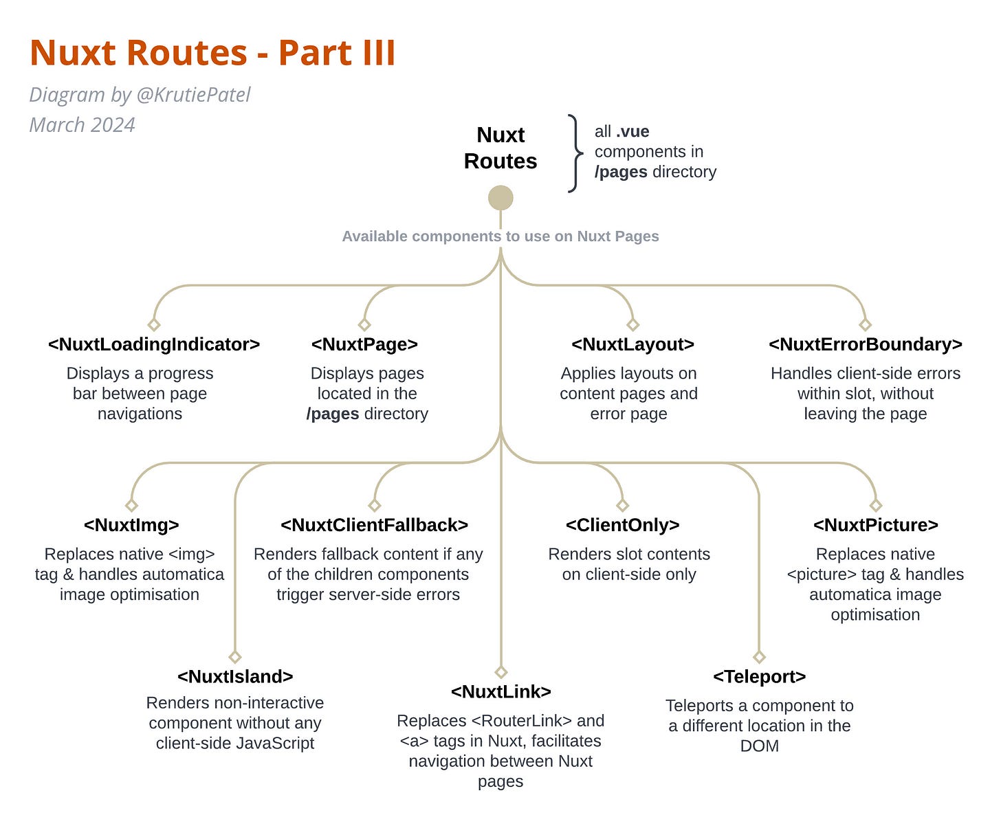
In our last newsletter, we looked at Nuxt Routes. We wrapped up with a sneak peek at all those cool built-in components provided by Nuxt.
<NuxtLoadingIndicator/> is one the built-in component provided by Nuxt. So, in our Nuxt Fundamentals segment today, we're diving into the basics of Loading Indicators, exploring their design principles, and showing you how to build a custom one for your Nuxt project.
Happy reading!
Nuxter’s Corner
Let’s set Nuxt aside for a moment, zoom out and look at Loading Indicators from a broader frontend perspective. Loading indicators serve as a bridge of communication between the application and its users during times of waiting, be it for data to load, content to be fetched, or transactions to be processed. Their presence, or lack thereof, can drastically affect the user experience, potentially turning moments of waiting into a frustrating pause of inactivity.
Check out the diagram below. It shows you all the different loading indicators you can use in your web application, when to use them, and high-level implementation details to make them tick.
Loading indicators come in various forms, each suited to different scenarios and user expectations. From the classic spinner that symbolises ongoing activity to progress bars that provide a visual cue of how much work has been completed. These indicators show how careful design meets with focusing on the user's needs.
Spinner: It's best used in scenarios where the wait time is unpredictable or relatively short. The spinner, often represented as a circular animation that rotates infinitely, is the quintessential symbol of something "in the process."
Progress Bar: They are most effective when the system can predict the time to completion with reasonable accuracy. Progress bars are linear indicators that fill up as a task progresses.
Skeleton Component: Instead of showing a blank screen or a loading sign, skeleton screens give a preview of what's to come, which can psychologically make the wait feel shorter because users see evidence of work being done. Skeleton Components are a relatively modern approach compared to the spinner and progress bar. Skeleton components are placeholders that outline the basic structure of your content before it loads.
Custom Animations: These are particularly effective for branding purposes, creating a memorable experience even in the wait times. Custom animations are unique, brand-specific loading indicators that can range from simple geometric transformations to complex scenes or characters that tell a story.
Each type of loading indicator serves a specific purpose and can influence the user experience in different ways. The choice of indicator should be driven by the:
context of the wait time,
expected duration, and
overall design language of the application.
Returning our focus back to Nuxt, the framework offers a variety of methods to manage loading indicators, enriching the user experience during navigation and data retrieval.
For instance, when transitioning between pages, the <NuxtLoadingIndicator /> component comes into play that elegantly renders a progress bar and visually informs the user of the ongoing process.
<NuxtLoadingIndicator /> falls into the Progress Bar category of the loading indicator, since it predicts the estimated time to load the content of the page.
This component can be customised by overriding color, height, duration and throttle values. You can also provide custom calculation for how estimatedProgress is calculated. However, this is the extent of customisation you can perform on this built-in component.
Digging deeper into the implementation of <NuxtLoadingIndicator /> component, we can see that it uses useLoadingIndicator composable under the hood. useLoadingIndicator uses page:loading:start and page:loading:end hooks to update its state.
useLoadingIndicator composable accepts duration, throttle and estimatedProgress as props. You can calculate estimatedProgress using a similar calculation used in <NuxtLoadingIndicator /> component. In return, useLoadingIndicator provides us with:
two variables: progress, isLoading and
three methods: start(), finish() and clear().
const { progress, isLoading, start, finish, clear } = useLoadingIndicator({
   duration: props.duration,
   throttle: props.throttle,
   estimatedProgress: props.estimatedProgress
})
progress and isLoading variables are sufficient to create a custom loading indicator. You can show/hide your custom loading component using isLoading variable, and animate your HTML or SVG element using the progress value which changes from 0 to 100.
start() and finish() methods come in handy while designing and developing a custom loading component, as they let you start and finish the transition respectively, on demand with a click of a button. You can review a quick example of a custom loader example here on Stackblitz.
Break down this tiny example and you will see that we are using,
<NuxtLink> component to switch between pages
<NuxtPage> component to display page content
useLoadingIndicator composable to create custom loader
CSS transition to apply app wide page transition
<Transition> component (from Vue) to add fade effect
Moreover, Nuxt extends its functionality to data fetching scenarios, including asynchronous operations, by returning a pending variable when you use useFetch or useAsyncData composable.
const { data, pending, error, refresh } = await useFetch('/api/modules')const { data, pending, error, refresh } = await useAsyncData(
'mountains',
() => $fetch('https://api.nuxtjs.dev/mountains')
)In the template section of your page or Vue component, you can check the value of the pending variable and render the skeleton component while the data is being loaded. If you are familiar with Nuxt UI, you can check out the <USkeleton> component which lets you show a placeholder skeleton while content is loading.
This versatile utility enables Nuxt developers to either display a spinner or a skeleton component, and help maintain a smooth and informative interaction as data loads.
Creating effective loading indicators involves more than just choosing between a spinner or a progress bar. We should be mindful of basic design principles while incorporating loading indicators in our web applications, such as:
Visibility: Loading indicators must be clearly visible without overwhelming the user interface.
Informative: An effective loading indicator provides users with information about what is happening behind the scenes. Whenever possible, it should offer more than just an indication that something is loading; it should convey progress or estimated wait times.
Minimalism: Loading indicators should not distract users from their primary objectives or clutter the interface. The design should be simple and clean that integrates seamlessly with the overall design language of the application.
Branding: Loading indicators offer a unique opportunity to reinforce brand identity, even in moments of waiting. Custom animations or brand-specific designs can turn a generic wait time into a branded experience. However, this should be balanced with the principles of visibility and minimalism to ensure that the branding effort does not compromise the indicator's functionality or the user experience.
I'm really putting in the work to push these contents past the usual tutorials, aiming for something that reads more like a deep-dive chapter. The goal? To boost your know-how in a way that goes beyond just frameworks. Master one, and you'll have the skills to tackle any of them.
Keeping that in mind, it's not just about the basics and design principles. I'm also keen on weaving in some best practices and a guide to making your loading indicators not only responsive but accessible too, for all kinds of web apps.
If the roadmap of my Nuxt book appeals to you and you're keen on the direction it's heading, I'd love to invite you to subscribe to the NuxtDojo newsletter. By subscribing, you'll gain access to exclusive updates about the progress of my book, as well as the opportunity to be among the first to receive the early release of each chapter.
Designer’s Corner
What's your go-to move when work starts to feel like a bit of a drag and you're itching for a breather to reset your brain?
For me, when the whole Vue and React scene starts to get a bit too much, I like to kick it old school with some HTML and CSS. It's kind of like my chill pill. It does wonders for me, and by the time I circle back to the heavy stuff, I'm all refreshed and pumped to dive back in.


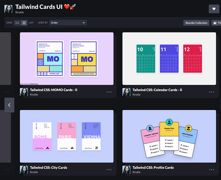
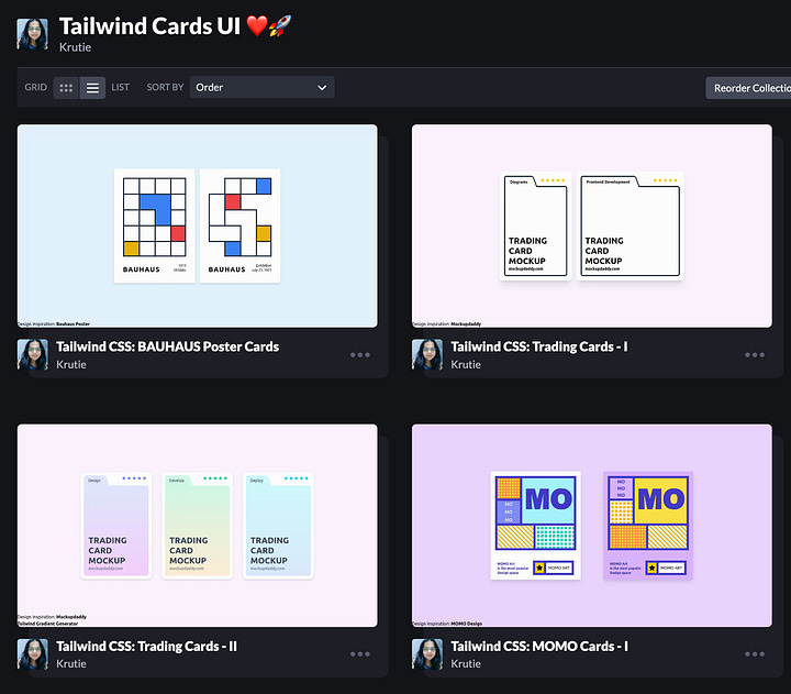
Alright, let me fill you in on this little project I've got going on Codepen, kind of a side-side hustle of mine. I've been keeping it super simple, sticking to just plain HTML and spicing things up with Tailwind CSS. It's my little sandbox where I get to play around, experiment, and just have some fun away from all the serious stuff.
I've got this plan to keep up with this small yet fulfilling routine: crafting cards on the side as I work on writing my Nuxt book. I'm curious to see how these two projects can inspire and energise each other. They could serve as practical examples or visual aids when I'm explaining concepts in the book. It's like having two creative paths that, while distinct, complement each other beautifully, making the journey of writing the book not just more informative but also more engaging.
Thank you for reading this far! I really hope you’ve found some inspiration and enlightenment within these pages.
🚀 How You Can Participate:
📚 Read Along: Subscribe to the newsletter to receive updates, diagrams, and behind-the-scenes content.
🤝 Community Interaction: Share topic suggestions for the book, questions, and insights here on NuxtDojo Substack.
🚀 Spread the Word: Let others know about NuxtDojo – share on social media and among your developer circles.
Warm regards,
Krutie @ NuxtDojo 🚀📚


